User Tests
This study put special emphasis on how users interact with this type of app. The tests were conducted according to LeanUX to get results quickly and improve upon them. To follow these guidelines, several user tests were held over the course of this thesis to determine the best methods. Each test focused on one specific question which was to be answered by using hypotheses and appropriate measurements.
-
Content Test
This test focused on how users interact with digital manuals in general and which barriers keep players from playing. All three manuals of the previously chosen games were reworked as a prototype in the form of a PDF file. Those PDFs were designed to hint at the design within an app.
-
Chunk Test Round 1
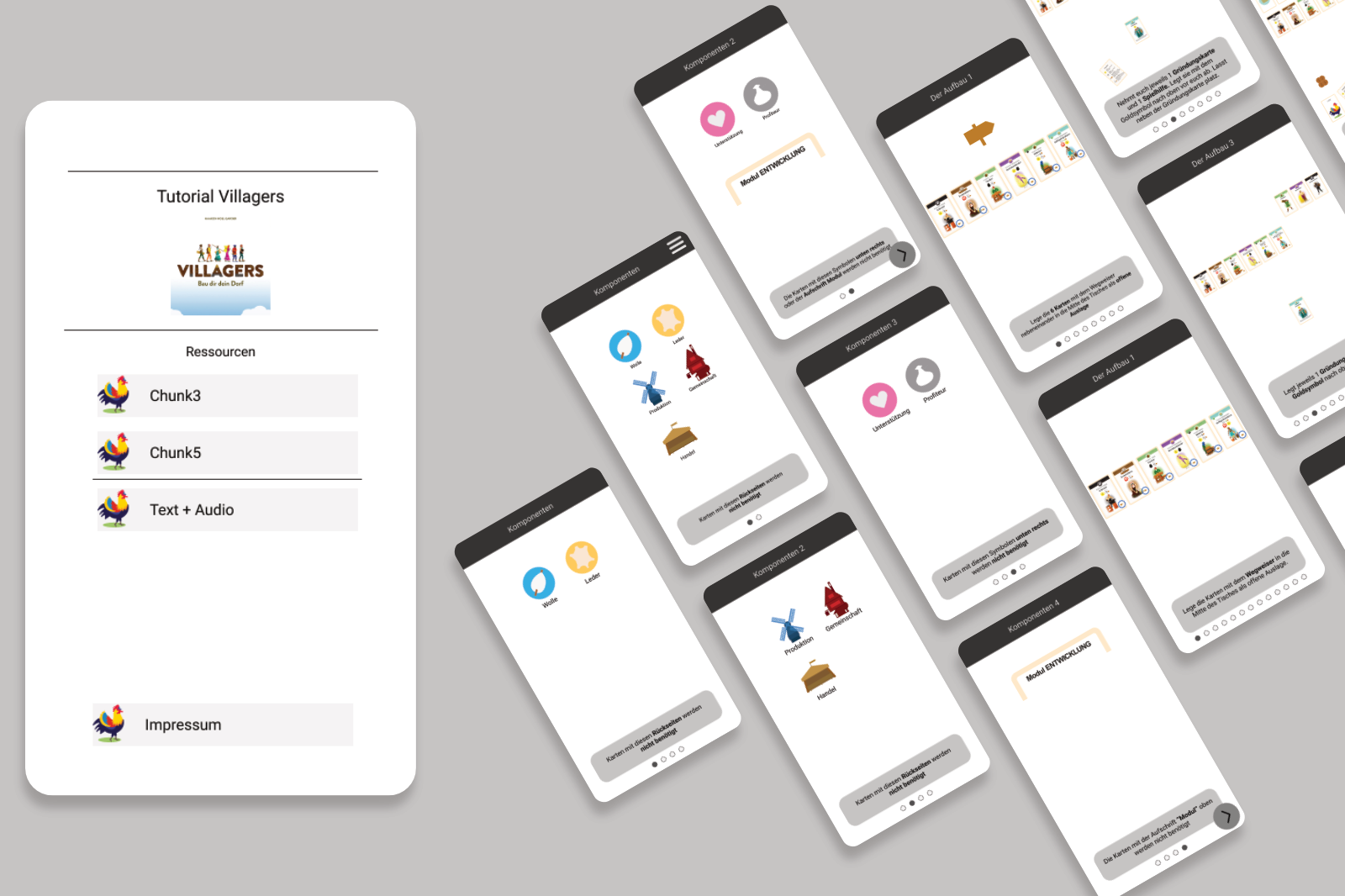
This test set out to determine how much information users can absorb at one point and whether audio output is necessary. The prototype, which is shown below, existed in three different versions. Two versions showed different amounts of information and the third version contained audio output.
-
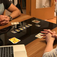
Chunk Test Round 2
Building off of the assumptions formed in round one this test was reworked to determine how many chunks of information should be displayed in one viewport. Again two versions of a prototype were made which featured different numbers of information chunks.
-
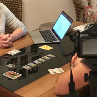
Audio Test
In this test users were provided with audio output to see whether users profited off of it and if they want to use it. All users got the same prototype with audio output and were told they could turn the sound off by using the volume buttons.
-
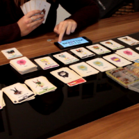
Configuration Test
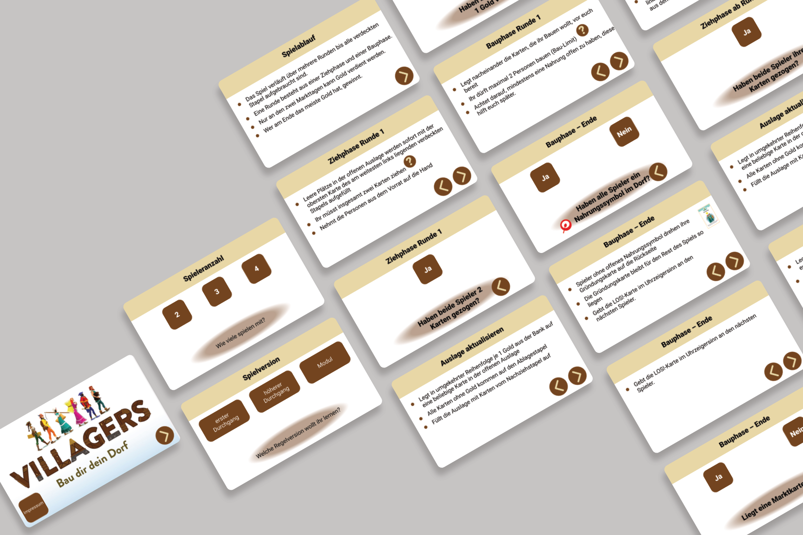
This last test was conducted to find out whether configuration of the content in addition to frequent checkpoints encourage the users to engage with the app. As shown in the image below, the prototype featured multiple questions to determine the game situation and could then provide only the instructions that were relevant to that.
-
Analysis
of
Results
